This post is a continuation of the previous one, where I demonstrated how to perform PCA with PLINK. While PLINK’s PCA is great for quick, exploratory analysis, smartpca (part of the EIGENSOFT toolset) is particularly common in population-genetic and ancient-DNA studies.
Smartpca can be compiled from the EIGENSOFT source or installed through conda. I covered the installation process in this earlier post: From EIGENSTRAT to PACKEDPED.
As before, I’ll use a small subset. The focus here is on the technical process. One key difference in this post is that I’ll perform Linkage Disequilibrium (LD) pruning, which reduces redundancy between correlated SNPs before PCA.
LD Pruning
# Window size: 50 SNPs
# Step size: 5 SNPs
# LD threshold: r² > 0.2 will be pruned

plink --bfile input --indep-pairwise 50 5 0.2

# Extract the pruned SNPs into a new dataset

plink --bfile input \
  --extract plink.prune.in \
  --make-bed \
  --out final
Note: If you’re working with low-coverage ancient samples, I would avoid estimating LD directly from a mixed modern + ancient dataset. Ancient samples usually have considerably more missing data, and often pseudo-haploid genotypes, which makes them poorly suited for estimating LD.
A better approach is:
- Calculate the LD-pruning set using the modern reference samples.
- Apply the same SNP list to the ancient samples.
- Merge the resulting datasets.
For example:
# Step 1: Prune the modern samples

plink --bfile modern \
  --indep-pairwise 50 5 0.2

# Step 2: Apply the same SNP list to both datasets

plink --bfile modern \
  --extract plink.prune.in \
  --make-bed \
  --out pruned_modern

plink --bfile ancient \
  --extract plink.prune.in \
  --make-bed \
  --out ancient_extracted

# Step 3: Merge the datasets

plink --bfile pruned_modern \
  --bmerge ancient_extracted \
  --make-bed \
  --out final
This gives us our final PACKEDPED dataset:
final.bed
final.bim
final.fam
Preparing the PACKEDPED Dataset for Smartpca
Smartpca can read PLINK’s binary PACKEDPED format directly, so there is no need to convert the dataset back to EIGENSTRAT or PACKEDANCESTRYMAP first.
The three files can be supplied directly to smartpca:
genotypename:     final.bed
snpname:          final.bim
indivname:        final.fam
A PLINK .fam file contains six columns:
FID IID father mother sex phenotype
For example:
2032 TLA018.HO 0 0 1 2
2033 TLA019.HO 0 0 1 2
2034 TLA020.HO 0 0 1 2
When EIGENSOFT reads PED or PACKEDPED data, the sixth column can also be used as a population group label. This is useful because smartpca uses population labels to determine which samples define the PCA axes and which are projected.
For this PCA, I’ll keep the sixth column as 1 for reference samples and the samples I want to project are labelled P:
2032 TLA018.HO 0 0 1 1
2033 TLA019.HO 0 0 1 P
2034 TLA020.HO 0 0 1 1
After replacing the phenotype column with population labels, I would treat this .fam as input for smartpca rather than as a normal PLINK phenotype file. If you need to preserve phenotype information for another analysis, keep a copy of the original .fam.
Creating the Smartpca Parameter File
Like most EIGENSOFT tools, smartpca uses a parameter file to specify its input, output and analysis options.
Create a file called pca_param:
genotypename:     final.bed
snpname:          final.bim
indivname:        final.fam

evecoutname:      pca.evec
evaloutname:      pca.eval

altnormstyle:     NO
numoutevec:       10
numoutlieriter:   0

lsqproject:       YES
poplistname:      pca.poplist

familynames:      NO
numthreads:       5
There are three options here that are particularly important for this workflow.
lsqproject
lsqproject: YES
This enables projection using least-squares equations.
When the PCs are calculated from higher-quality reference samples while lower-coverage or higher-missingness ancient samples are projected onto those axes.
On its own, however, lsqproject does not decide which samples define the PCA axes.
For that, we use poplistname.
poplistname
In the example above, all samples used to define the PCA axes have 1 in the sixth column of final.fam, while projected samples have P.
In PACKEDPED input, smartpca interprets the phenotype code 1 as the population label Control. The custom label P is kept as-is. So we create a population list containing only Control:
Run:
echo Case > pca.poplist
Smartpca will calculate the principal components using samples belonging to populations listed in pca.poplist.
Since P is not in the list, those individuals do not influence the calculation of the axes and are instead projected onto them.
If your reference samples already have real population labels rather than a single Case label, you can use those directly. For example:
1001 HGDP01001 0 0 1 Sardinian
1002 HGDP01002 0 0 2 Greek
1003 HGDP01003 0 0 1 Russian
2033 TLA019.HO  0 0 1 P
Then generate the reference population list with:
awk '$6!="P"{print $6}' final.fam | sort -u > pca.poplist
This would create something like:
Greek
Russian
Sardinian
familynames
I also set:
familynames: NO
By default, EIGENSOFT combines the PLINK family ID and individual ID when reading PED/PACKEDPED data.
For example:
11788 HGDP00553.HO
would otherwise appear in the PCA output as:
11788:HGDP00553.HO
I don’t need the family IDs here, so disabling this behavior keeps the sample IDs as:
HGDP00553.HO
This also makes the plotting steps below considerably simpler.
Running Smartpca
Now run smartpca with:
smartpca -p pca_param
The two main output files are:
pca.eval
pca.evec
pca.eval contains the eigenvalues, while pca.evec contains the sample IDs, principal component coordinates and population labels.
Preparing for Plotting
To make the .evec output compatible with the plotting script from my previous tutorial, convert it to CSV and remove the final population column:
awk 'NR>1 {
  $NF=""
  sub(/[ \t]+$/, "")
  gsub(/[ \t]+/, ",")
  print
}' pca.evec > smartpca.csv
The resulting file looks something like:
HGDP00553.HO,0.0136,0.0104,0.0353,-0.0510,...
HGDP00554.HO,0.0136,0.0107,0.0334,-0.0494,...
HGDP00555.HO,0.0137,0.0104,0.0346,-0.0511,...
At this point, you have two options:
- Use the Python plotting script*from my previous PLINK PCA tutorial
- Use Vahaduo for browser-based interactive visualization
Option 1: Plotting with Python
If you’ve already set up Python and created the plotting script from the PLINK tutorial, you can use it directly.
The Case and P labels in final.fam were only used to tell smartpca which samples should define the axes. They are not useful as population labels for plotting.
Since the original dataset already contains population assignments in data.ind, we can recover them from there.
Create a labels file with:
awk '
  NR==FNR {
    map[$1]=$3
    next
  }

  {
    split($0, a, ",")
    print map[a[1]]
  }
' data.ind smartpca.csv > labels
Then use:
smartpca.csv
labels
with the plotting script from my previous PLINK PCA tutorial.
This is the resulting plot for a European subset:
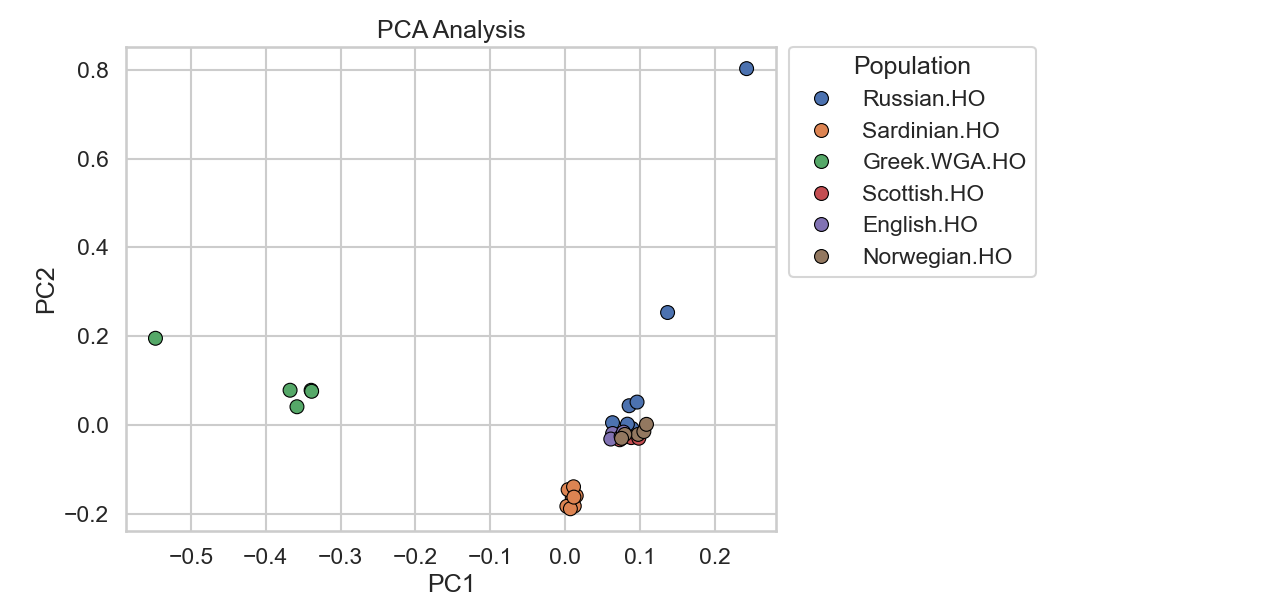
Note: The apparent spread of some samples can be exaggerated when PCA is calculated from a very small reference subset. With a larger reference panel, the axes generally become more stable and individual outliers tend to appear less extreme.
This is one reason ancient-DNA studies commonly calculate PCA axes using larger, higher-quality reference panels and project ancient samples rather than allowing sparse ancient genotypes to influence the axes themselves.
Option 2: Plotting with Vahaduo (No Coding Required)
Vahaduo is a web-based tool that can generate interactive 2D and 3D PCA plots without requiring a Python setup.
However, it requires population labels to be embedded directly in the CSV file.
Our current smartpca.csv looks like this:
...
HGDP00553.HO,0.0136,0.0104,0.0353,-0.0510,...
HGDP00554.HO,0.0136,0.0107,0.0334,-0.0494,...
HGDP00555.HO,0.0137,0.0104,0.0346,-0.0511,...
...
Vahaduo groups samples using the text before the : character, so we can prepend the original population label to each sample ID.
The following awk command uses the original data.ind file from the downloaded EIGENSOFT dataset:
awk -F',' -v OFS=',' '
  NR == FNR {
    line = $0

    gsub(/^[[:space:]]+/, "", line)

    if (line == "")
      next

    split(line, a, /[[:space:]]+/)

    if (a[1] == "" || a[3] == "")
      next

    label = a[3]

    # Remove common dataset suffixes from population labels
    sub(/\.(AG|DG|HO|SG)$/, "", label)

    pop[a[1]] = label
    next
  }

  {
    if ($1 in pop)
      $1 = pop[$1] ":" $1

    print
  }
' data.ind smartpca.csv > smartpca_with_labels.csv
This transforms the file into, for example:
...
Papuan:HGDP00553.HO,0.0136,0.0104,0.0353,-0.0510,...
Papuan:HGDP00554.HO,0.0136,0.0107,0.0334,-0.0494,...
Papuan:HGDP00555.HO,0.0137,0.0104,0.0346,-0.0511,...
...
Using Vahaduo
- Go to https://vahaduo.github.io/custompca/
- Navigate to the PCA tool
- Paste the contents of
smartpca_with_labels.csvinto the PCA Data section - Click Plot PCA in the PCA plot section
Vahaduo provides several convenient features:
- No Python setup required
- Interactive plots
- Zooming and panning
- 3D visualization
- Hovering over individual samples
- Quick exploratory analysis
- Saving plots
PCA-Based Mixture Models
Vahaduo can also run a distance-minimizing heuristic that fits a target sample as a mixture of selected source groups, and the CSV produced above can be used with that feature.
PCA-based models are dataset-dependent and measure proximity in a reduced-dimensional space. That proximity can be useful for exploration, but it cannot by itself precisely infer ancestry or admixture proportions.